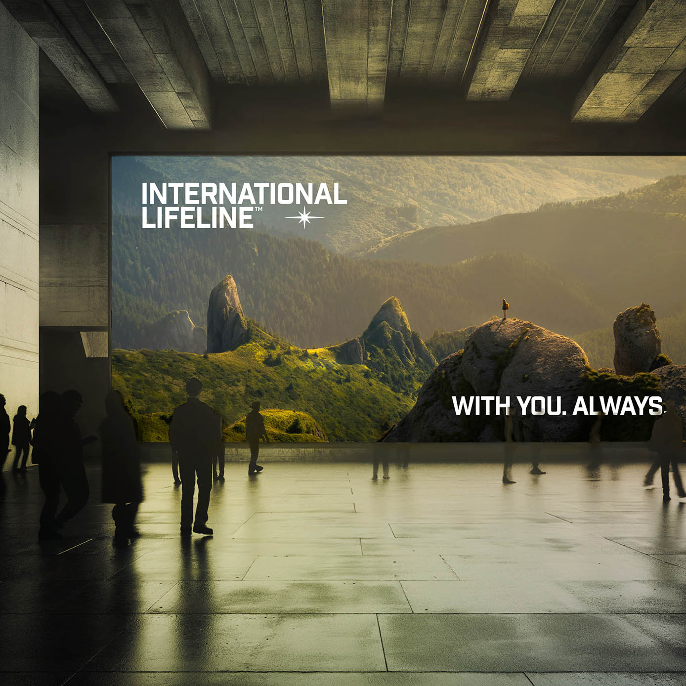
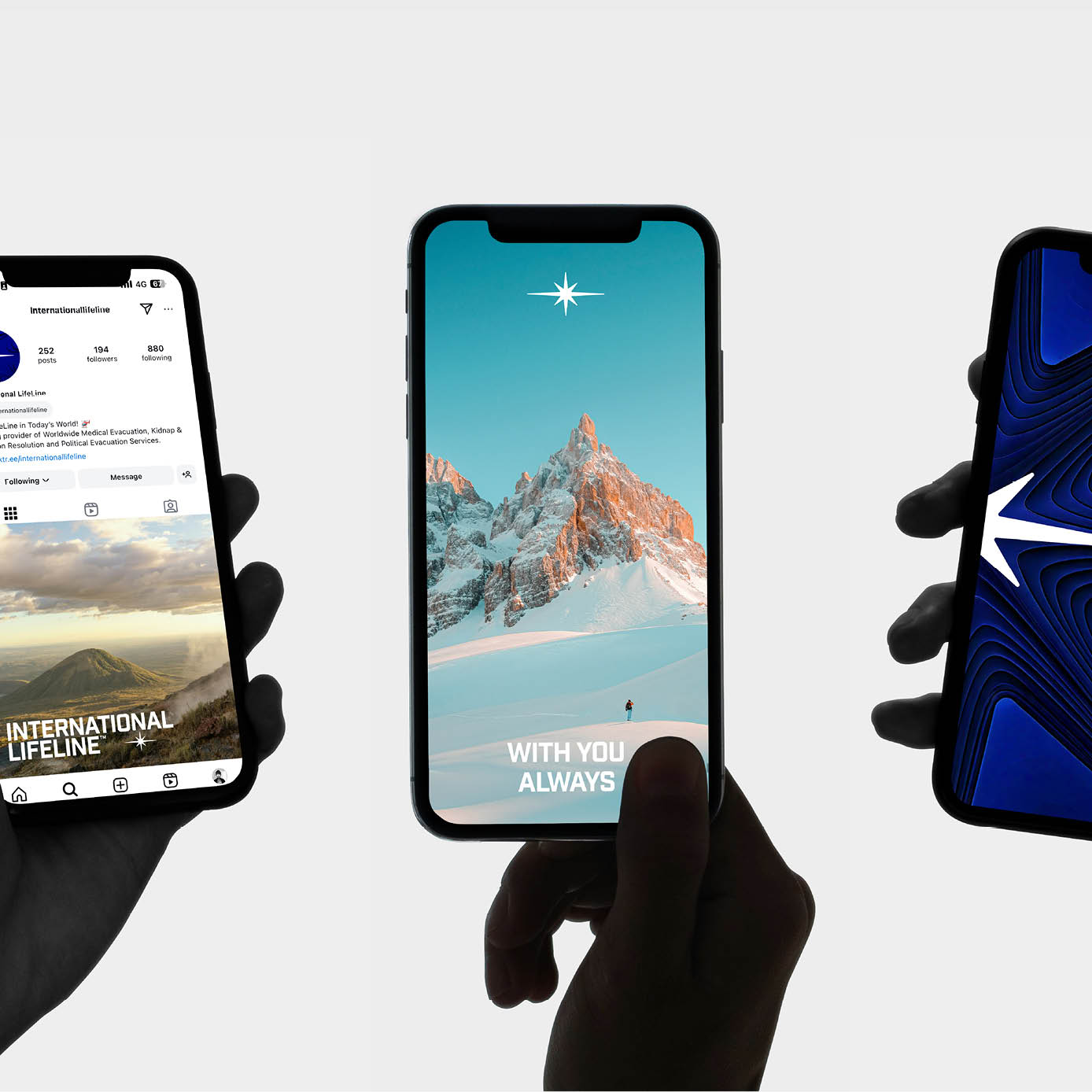
From the outset, it was clear that International Lifeline operated in a space built on trust, yet visually and verbally it felt much like everyone else. Safe palettes, familiar language, nothing that really stayed with you. In this crowded space, we saw an opportunity to give the brand a clearer sense of purpose. We anchored everything around the idea of a proverbial North Star. A point of guidance that is always there for clients, steady and dependable no matter the situation. From this came a more focused visual and verbal identity, one that feels calm, confident and quietly assured. These subtle but very deliberate shifts help International Lifeline stand apart from the noise around them, creating a presence that feels both reassuring and distinctive.
Kind words coming in due course.